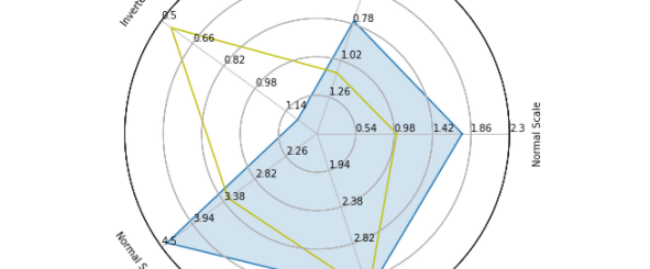
A (reasonably) complex radar chart
A radar (or spider) chart is a convenient method of displaying multivariate data in a form of 2-dimensional chart.
When I say convenient, I mean it is particularly well-accepted by people and gives a good intuition when comparing different items/subjects.
Think about comparing 2 (or more) football players in terms of dribbling, running speed, shots and pressure. Even with only four variables bar plot would become cumbersome to deal with and not immediate to perceive. That’s why they are particularly popular in sports analytics.
Incoveniences
However, radar charts come with their own incoveniences:
- eye tends to focus on area, so order of the variables must be chosen widely (see below)
- it’s extremely simple to perceive differences, but harder to examinate trade-offs and understand what they mean
- and more minor stuff.
A reminder, blatantly plagiarized from @stat_sam, of why radar plots are misleading. Eye focuses on area, not length. pic.twitter.com/Dk3gcn1GD1
— Luke Bornn (@LukeBornn) May 17, 2017
Oh and most importantly to this post, I found no “satisfactory” implementation of radar charts for Python.
Python implementations
Actually, mplsoccer (a library for soccer viz) has pretty good one, but that’s way more complicated than I needed (and requires a new dependency, which I cannot introduce).
Good results may be achieved with matplotlib, but essential features, like the ability to represent quantities on different scales, are to be manually implemented.
Stackexchange came to the rescue once again. Unfortunately, that did not work perfectly out-of-the-box: I suspect that is due to incompatibility with matplotlib version (running on 3.3.4).
You may find the modified gist below, which keeps the essential set of functionalities and fixes a couple of issues which made the result poorly readable:
- added method
adjust_labels(): labels are fixed (and readable…) - ordering of grid labels is fixed